MedPro
Your personal guide to medical procedures
AWARD RECEIVED
2022 American Advertising Awards
2022 American Advertising Awards
TEAM
1 UX Designer, 2 Healthcare Professionals
1 UX Designer, 2 Healthcare Professionals
︎ STUDENT PROJECT
Patients often feel lost and confused before surgery. MedPro, a mobile app, empowers patients undergoing Laparoscopic Cholecystectomy (the surgical removal of
gallbladder) by simplifying information, confirming understanding, and providing personalized guidance every step of the way.
THE CHALLENGE
The way patients are informed about medical procedures can be confusing
Consent forms for invasive procedures are too complex, averaging a college-level reading difficulty (15th grade) far beyond the US adult average (8th grade) , according to The Readability of Invasive Procedure Consent Forms.
![]() ︎︎︎ A consent form for the Cholecystectomy procedure
︎︎︎ A consent form for the Cholecystectomy procedure
 ︎︎︎ A consent form for the Cholecystectomy procedure
THE GOAL
Empowering patients through knowledge and guidance
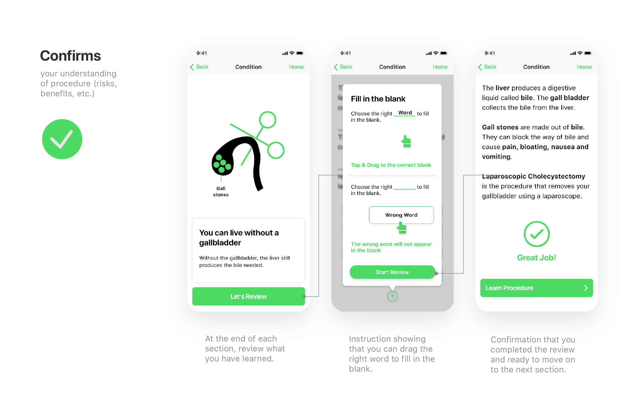
MedPro is a mobile app that aims to give patients a peace of mind by:
- Explaining the procedure in a simple walkthrough.
- Confirming their understanding in an interactive learning experience.
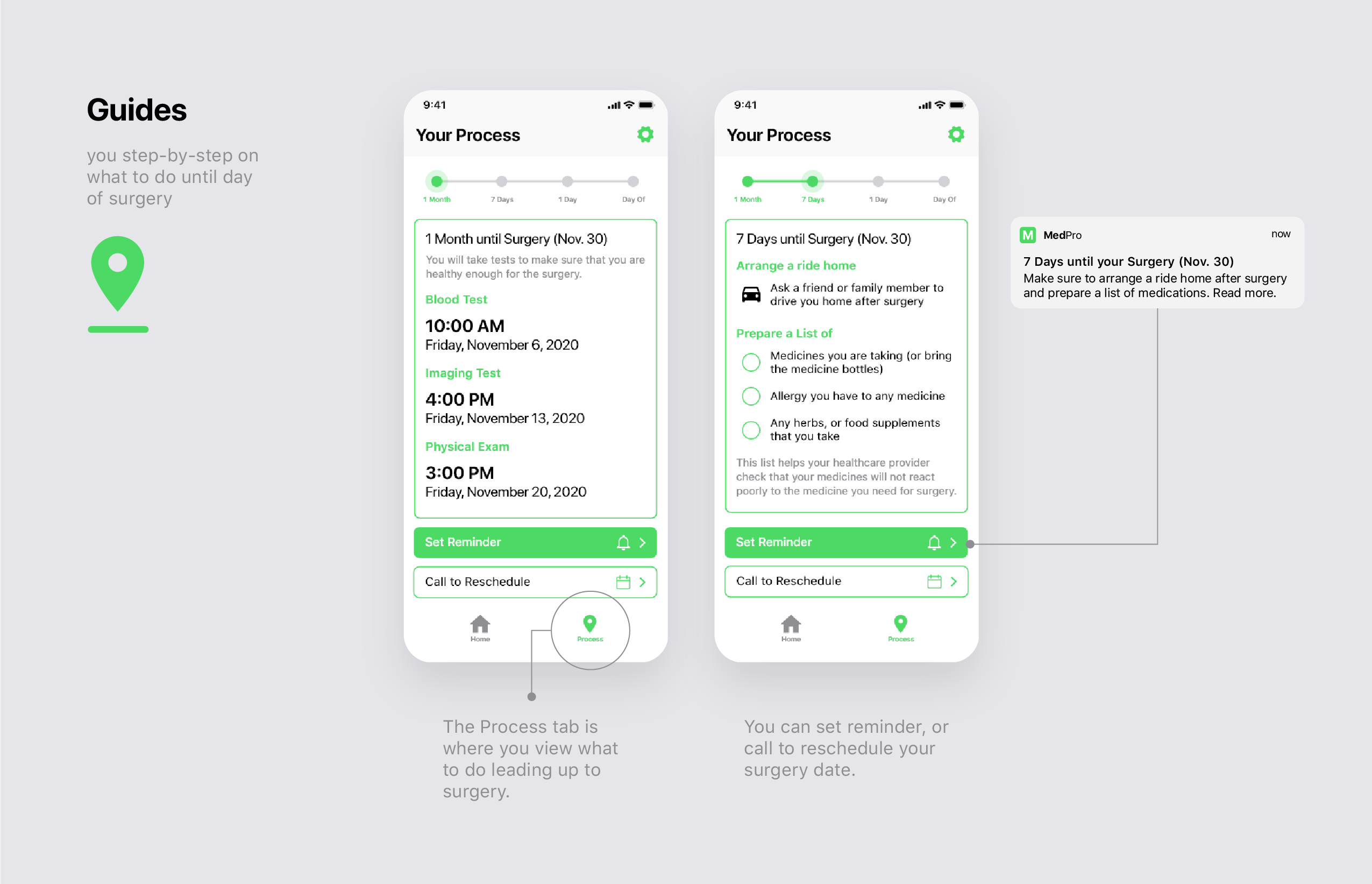
- Guiding them until the day of surgery.

RESEARCH
Building knowledge through background research
I began by conducting background research on the medical procedure. This involved interviewing a medical professional and reviewing medical online resources. The research allowed me to:
![]() ︎︎︎ Notes from background research
︎︎︎ Notes from background research
- Understand the different stages of the procedure.
- Create relevant and accurate content for the app.
 ︎︎︎ Notes from background research
Identifying pain points and oppportunities with experience map
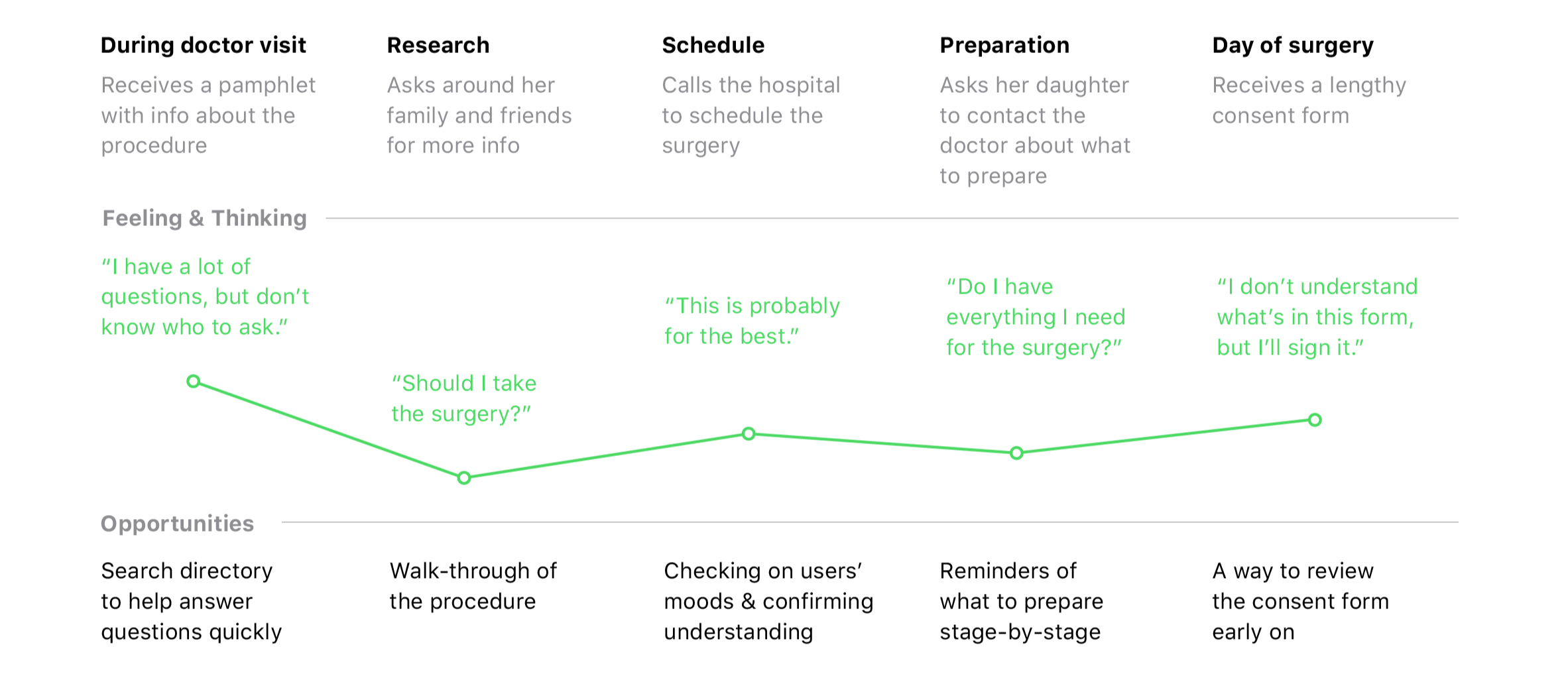
Mapping the patient journey: From informing to surgery
I mapped out the user flow from the moment a patient learns about the procedure, to the day of the surgery. The user flow diagram helped me visualize the different stages of the user's journey and to identify potential areas of difficulty.
 ︎︎︎
User flow diagram
︎︎︎
User flow diagramSitemap shapes MedPro's app architecture
Based on the background research and user flow, I created a sitemap for the app, which outlined the different sections and features that would be included in the app.
 ︎︎︎
Sitemap
︎︎︎
SitemapThumb zone study revealed flaw in illustration
I created paper wireframes of the app and conducted a thumb zone study to test out user flows.
The thumb zone study revealed that key buttons within the illustration needed to be enlarged by 30% to improve tap accuracy by users.
![]()
︎︎︎ Thumb zone study on wireframes
The thumb zone study revealed that key buttons within the illustration needed to be enlarged by 30% to improve tap accuracy by users.
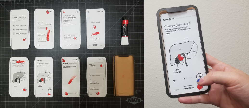
︎︎︎ Thumb zone study on wireframes
Testing out different layouts
To explore alternative approaches to learning the procedure, I created two mid-fidelity prototypes with differing information layouts.
Based on mentor feedback, the second prototype (right) was chosen for its clear step-by-step visuals and intuitive information flow, leading to a smoother user experience.
Based on mentor feedback, the second prototype (right) was chosen for its clear step-by-step visuals and intuitive information flow, leading to a smoother user experience.

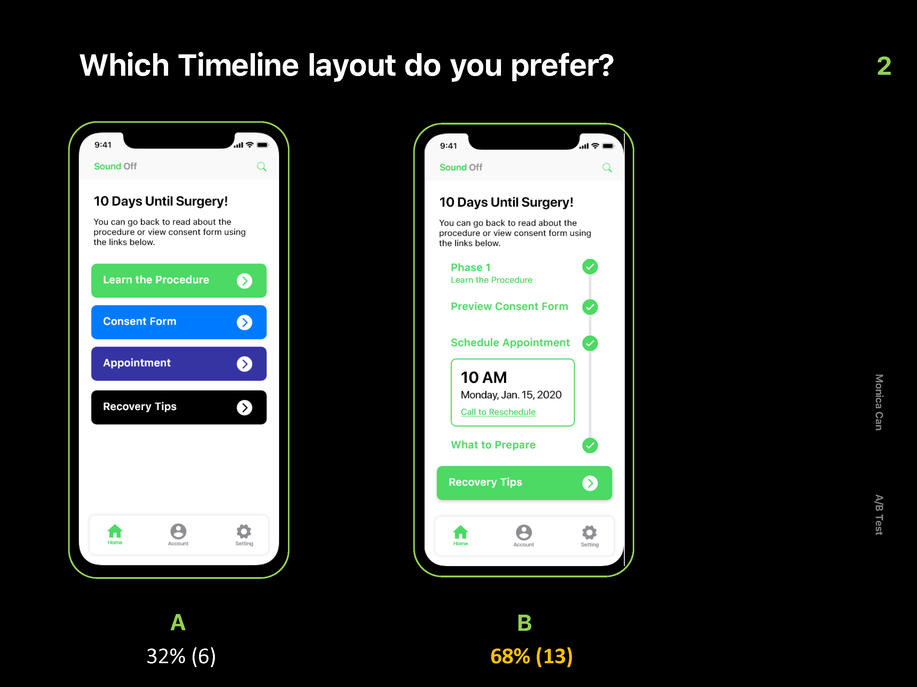
A/B testing for key screens
To make final decisions about key screens in the app, I conducted A/B testing. I showed different layouts of the design to 19 college students in their 20s.
Here are some noteable results:
Here are some noteable results:


RESULTS
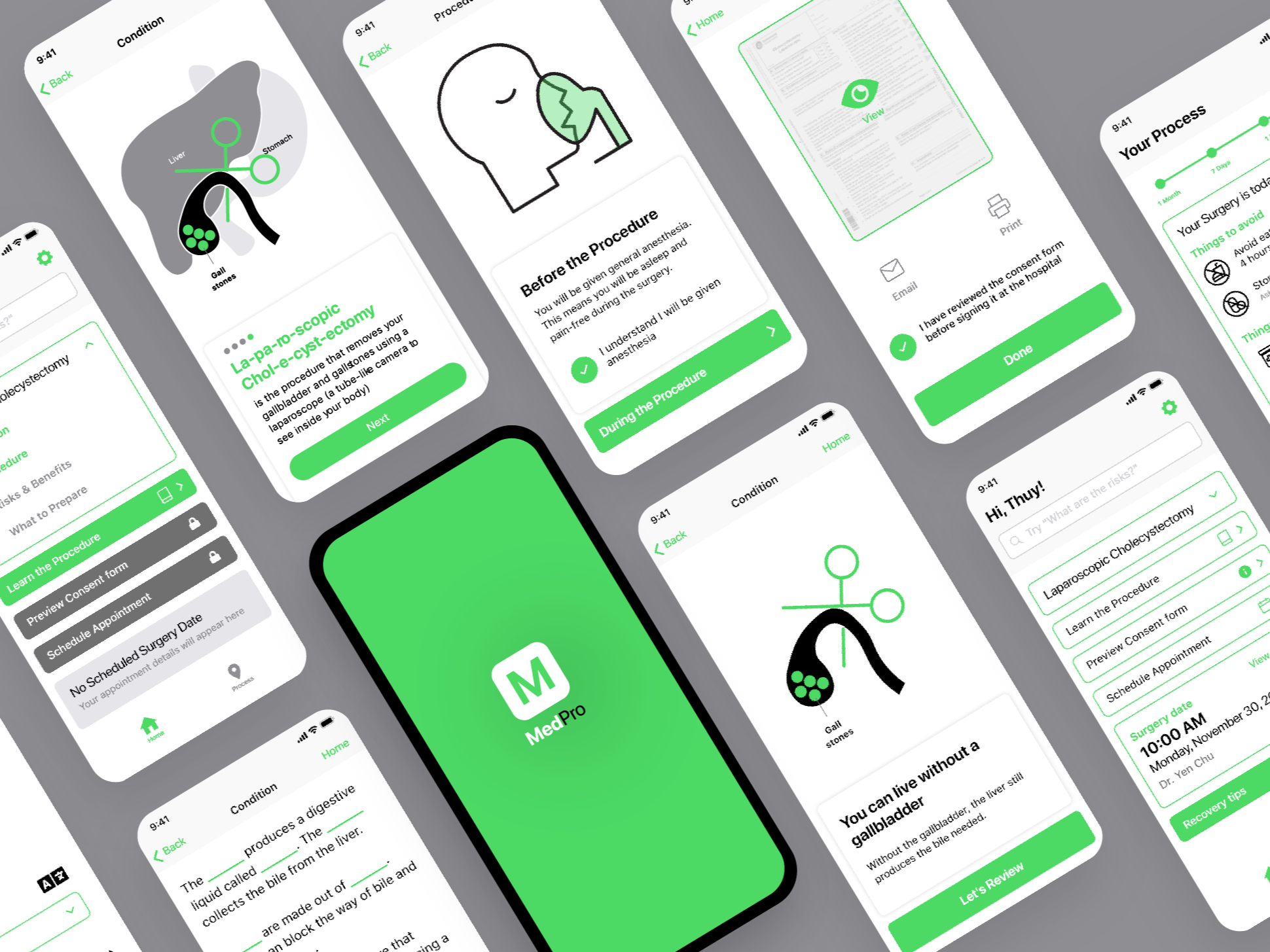
THE FINAL PRODUCT


If I had more time, I would...
- Enhance the visual aesthetics of the interface to make it more inviting and engaging
- Conduct a thorough accessibility audit to ensure compliance with Web Content Accessibility Guidelines (WCAG)
- Gather additional user feedback to identify pain points or areas for improvement
- Explore various methods to assess patient comprehension