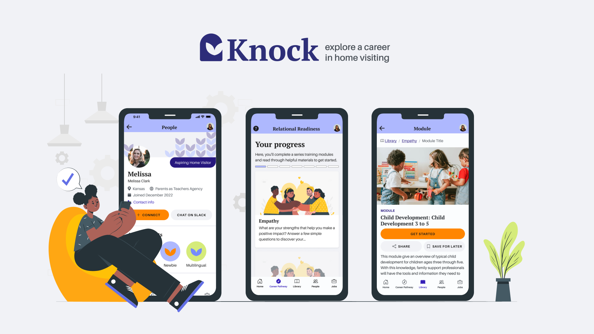
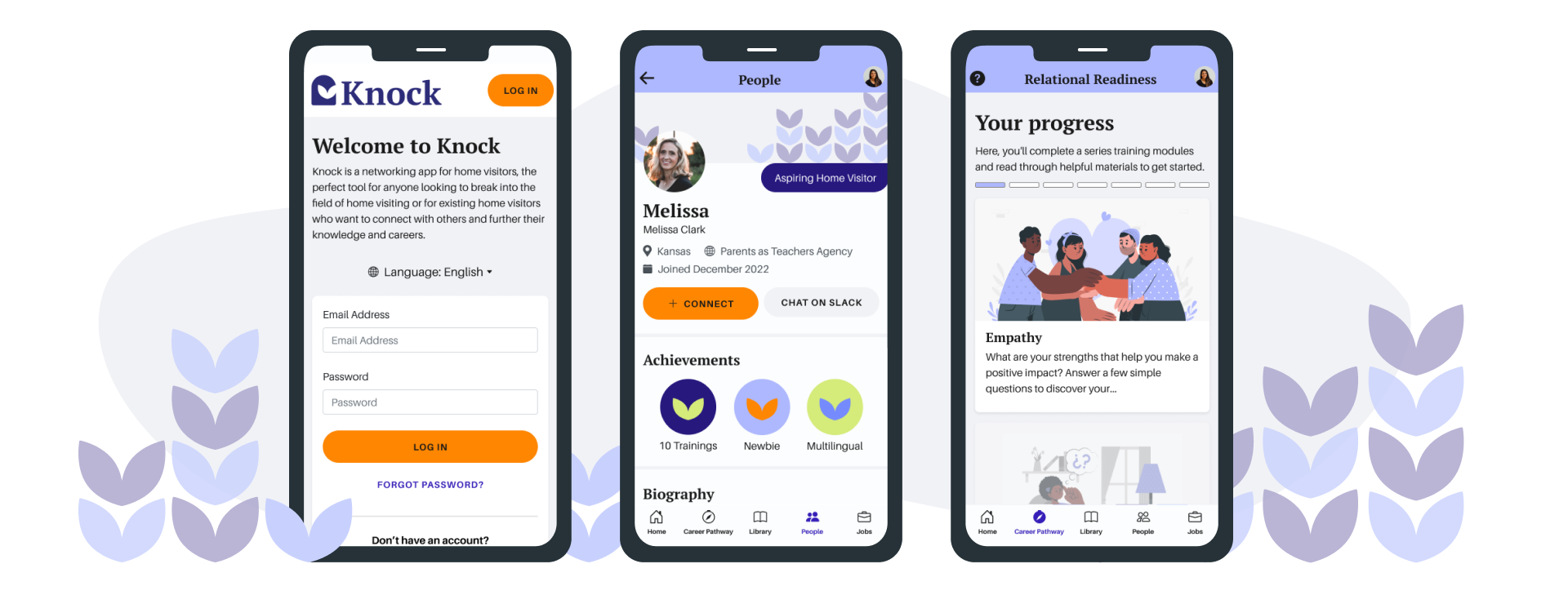
Knock
A learning and networking hub for home visitors
CLIENT
Institute for the Advancement of Family Support Professionals (the Institute) ︎︎︎
TIMELINE
7 months and ongoing
Institute for the Advancement of Family Support Professionals (the Institute) ︎︎︎
TIMELINE
7 months and ongoing
MY ROLE
User Research, Wireframing, Branding, Design System, Prototyping, Design QA
TEAM
2 UX Designers (including me), 1 Project Manager
User Research, Wireframing, Branding, Design System, Prototyping, Design QA
TEAM
2 UX Designers (including me), 1 Project Manager
Knock tackles the dual challenges of staff shortages and diversity gaps in home visiting by empowering aspiring professionals with a dedicated learning and networking app. Developed in collaboration with the Institute, Knock equips early-career and aspiring home visitors with the resources and connections they need to thrive in this crucial field.
THE CHALLENGE
Staff shortages & Diversity gap in home visiting workforce
Home visitors are trained professionals who provide support to families with young children.
The home-visiting workforce is having a hard time:
To combat these problems, the Institute, has collaborated with us to develop a learning and networking web app for aspiring home visitors.
The home-visiting workforce is having a hard time:
- Recruiting and retaining staff due to lack of a clear pathway.
Local agencies across Region X, found an average 12-month turnover rate of 23% (Home Visiting Career Trajectories Report).
- Diversifying the workforce to reflect better the families they serve.
African American and Hispanic families make up 15% each of Iowa's home visiting participants, but only 2% and 4.7% of providers identify as such (Family Support Workforce Study).
To combat these problems, the Institute, has collaborated with us to develop a learning and networking web app for aspiring home visitors.
THE SOLUTION
A hub to learn, connect and grow the home visitors’ community
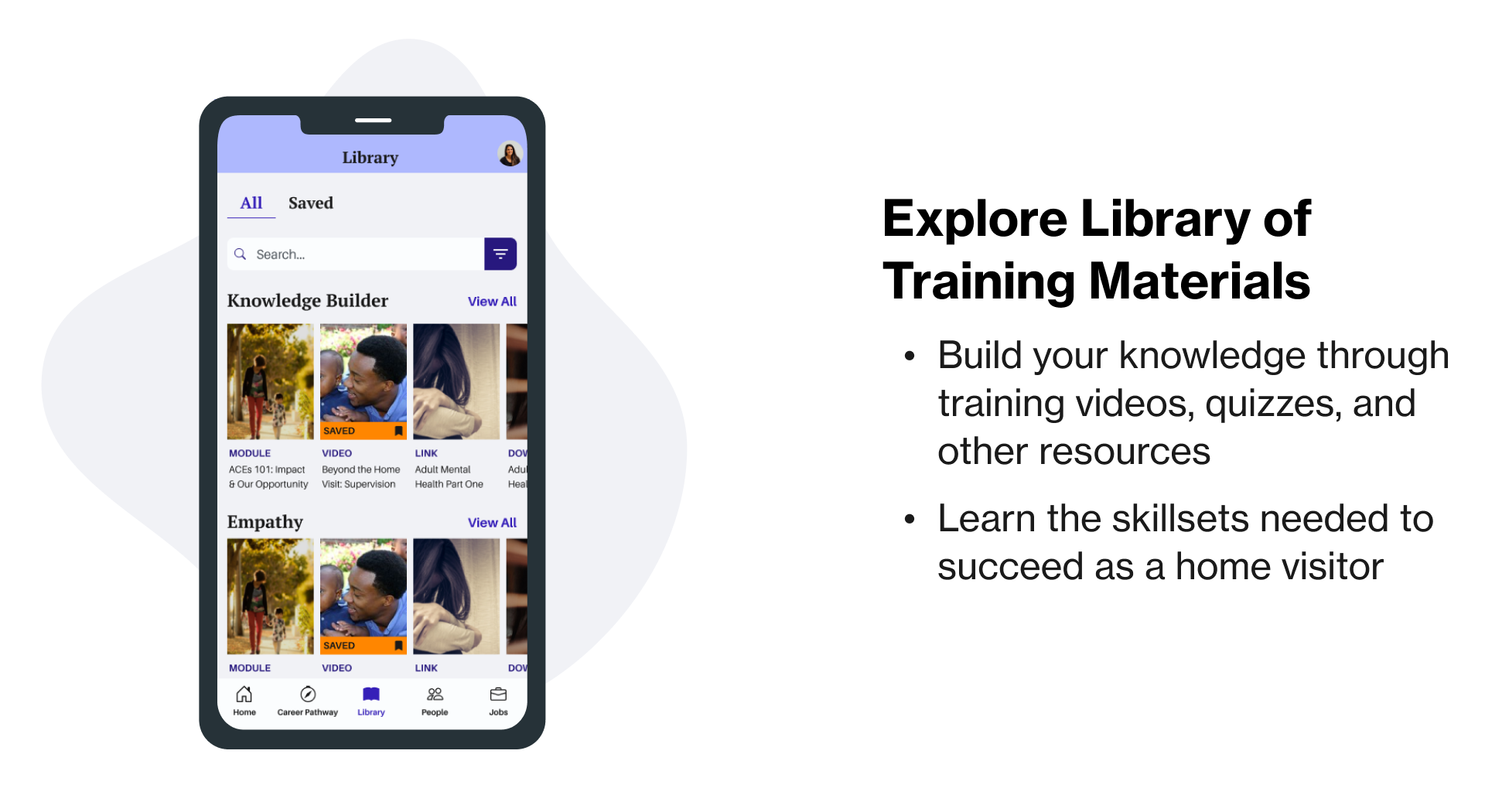
Our main goal is to develop a tool for aspiring home visitors to learn, connect, and further their careers. Features to help realize this goal include:


USER RESEARCH
Target audience
Our target audience are home visitors, specifically:
- Aspiring home visitors considering a career in the field.
- Early-career home visitors who seek professional development.
Prior research from client revealed lack of a clear pathway into the field
Research from the client revealed that a critical challenge for home visiting candidates is the lack of a clear pathway into the field.
To gain insights into the home visiting landscape and confirm client’s research, our team conducted our own user research leveraging interviews and affinity mapping.
We interviewed 10 home visitors with experience ranging from 1 to 23 years from Iowa, Virginia, and Illinois. We were interested in:
![]()
︎︎︎ Affinity mapping on FigJam
To gain insights into the home visiting landscape and confirm client’s research, our team conducted our own user research leveraging interviews and affinity mapping.
We interviewed 10 home visitors with experience ranging from 1 to 23 years from Iowa, Virginia, and Illinois. We were interested in:
- What attracts people to home-visiting
- What challenges people might face when getting into the field
- Whether the needs of home visitors aligned with the client’s research
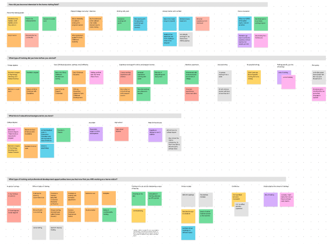
︎︎︎ Affinity mapping on FigJam
THE MAIN INSIGHTS
Personal experience as a key driver
Affinity mapping revealed the following as main factors in attracting people to home visiting, with personal experience as a standout:
- One’s own experiences, either from upbringing or from caring for children
- Passion for helping families and children
- Background in or exposure to adjacent fields, such as social work and caring for pregnant women
Roadblocks to home visiting:
Credentials, Mindset, Commitment, and Community
The exercise also indicated several main challenges for entry into home visiting:
︎ Our own research validated prior insights from the Institute and allowed us to gain a deeper understanding of the home visiting field.
- Having proper credentials and/or training
- Being prepared and open-minded
- Lack of commitment to the field
- Not having a community for professional development and support
︎ Our own research validated prior insights from the Institute and allowed us to gain a deeper understanding of the home visiting field.
THE BRANDING
A trustworthy and approachable visual design that harmonizes with the Institute’s branding
Through brand positioning, we identified “formal” and “friendly” as key attributes for our product in relation to other social media apps.
- “Formal” as it is a professional development platform
- But also need to feel “friendly” to attract and retain users.

︎︎︎ Brand Positioning

︎︎︎ List of characteristics
We went through three rounds of branding iterations to determine the optimal visual language that meets the qualities above.
- Round 1: Structure was good but colors needed to soften.
-
Round 2: Needed more colors similar to client’s existing branding.
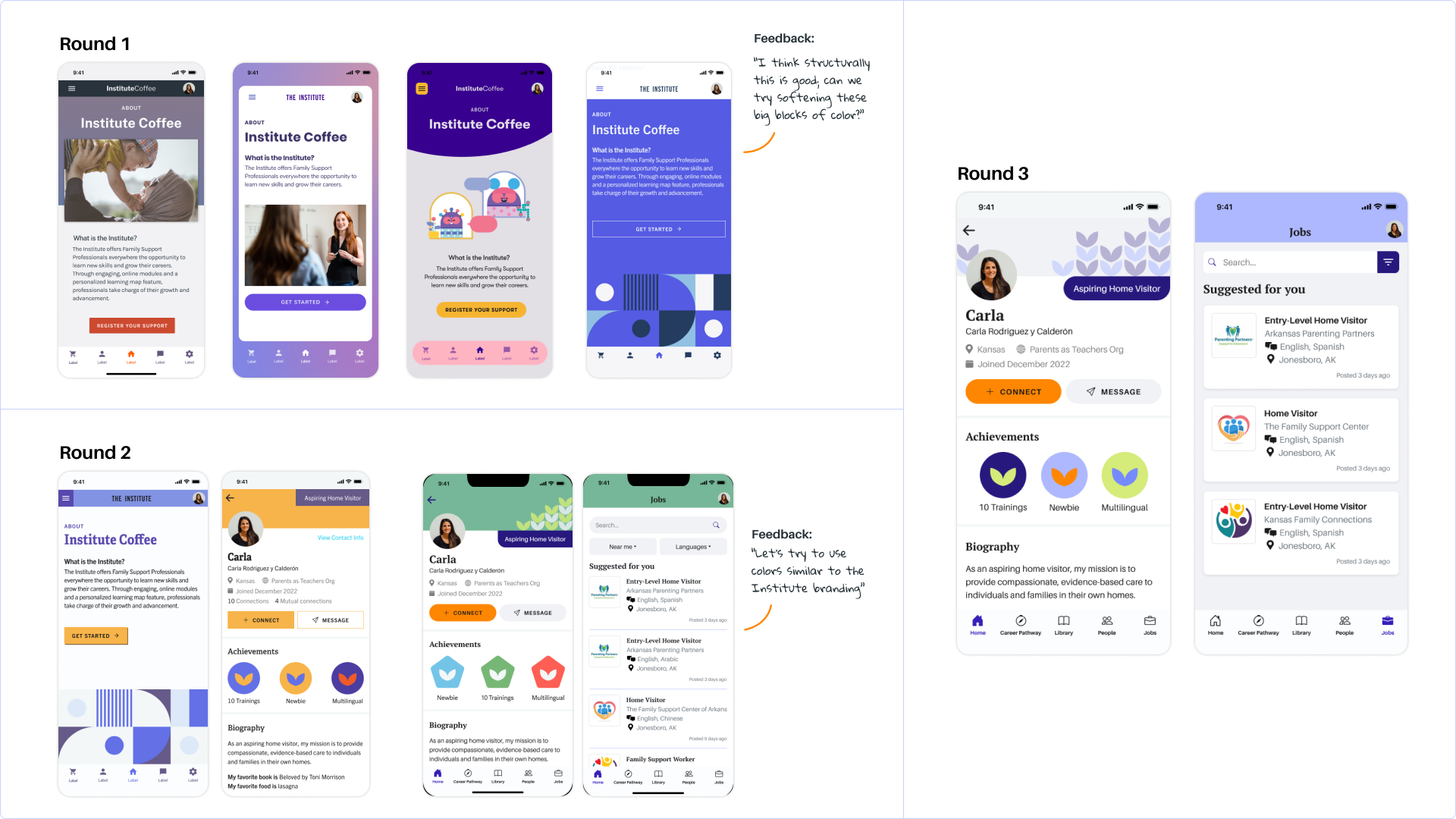
︎︎︎ Rounds of branding explorations
Three major UX iterations
Based on our research and the feedback of our client, we continually iterated our design with three major iterations:
01. Replaced forum feature with Slack integration
- Client initially suggested having in-app groups and chat functions.
- Feedback and research favored Slack integration, a common community app.
- This change avoided feature overload and duplicating existing solutions.

02. Two-way connection request over One-way
- We considered the possibility of a one-way connection, similar to following on Instagram.
- Based on client feedback, we opted for two-way connection over one-way, avoiding an influencer-focused model by requiring users to actively accept friend requests.

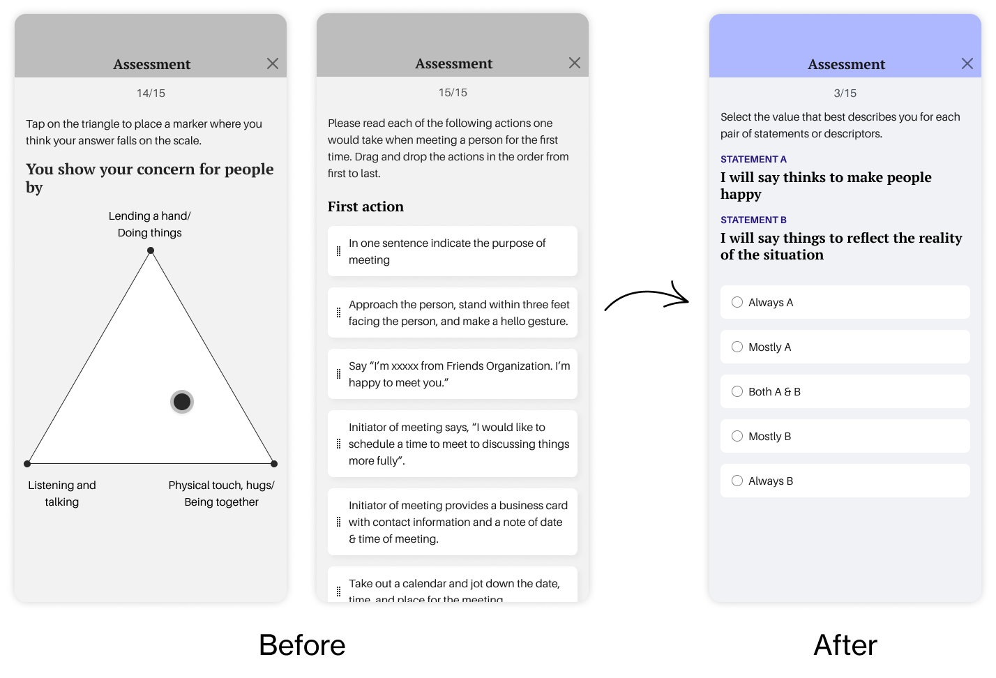
03. Standardize the assessment format
- Client initially presented diverse question types (multiple choices, drag-and-drop, slider, matching, etc.) for the assessment feature.
- We anticipated there would be accessibility issues with more complicated interactions notably the drag-and-drop and matching.
- Simplified by standardizing the quiz format to only multiple choices.
The final design
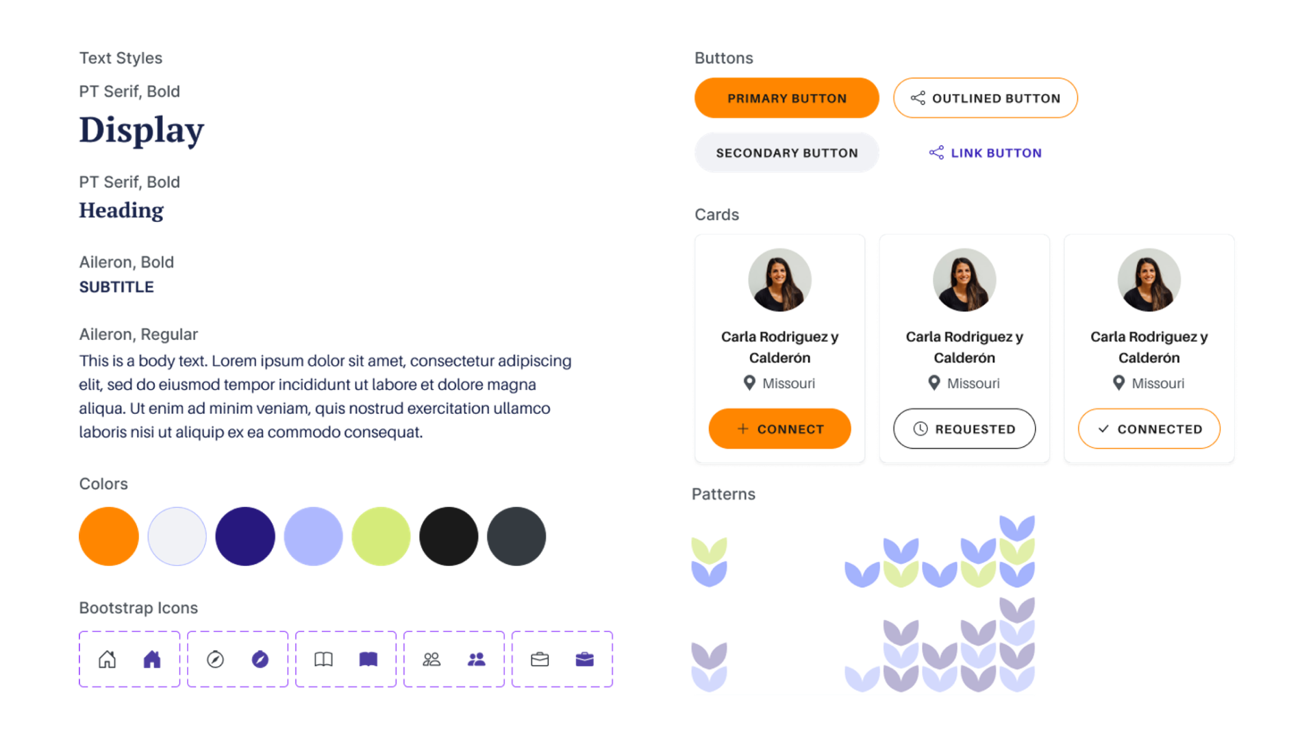
We were happy with the final iteration because it aligns well with the Institute’s current identity while having a warm and inviting appearance. Elements key to this design are:
- Rounded buttons for a welcoming feel
- Light purple and popping orange for a familiar yet refreshing tie-in with the Institute
- Contemporary serif for headings communicates trustworthiness but pairs well with Neo-grotesques for a clean and simple look in the body font
- Leaves pattern symbolizes growth & community
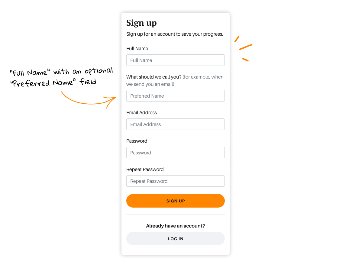
Inclusive name fields for a diverse workforce
- The standardized "First" and "Last" names approach on forms excludes certain naming conventions.
- We implemented inclusive naming fields, offering "Full Name" with optional "Preferred Name” fields for the Sign up form.
- The client loved these changes, seeing both the respect for diverse customs and the potential for a more representative workforce.
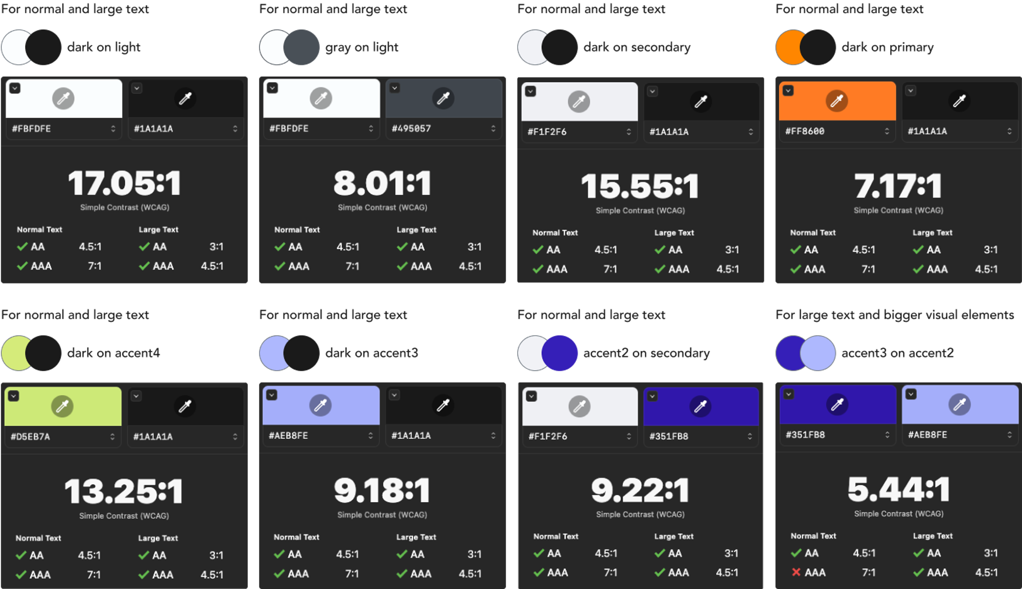
Accessibility-first colour palette
- We ensured proper contrast between text and background for better visibility.
-
We provided a style guide for developers to choose accessible colour combinations.
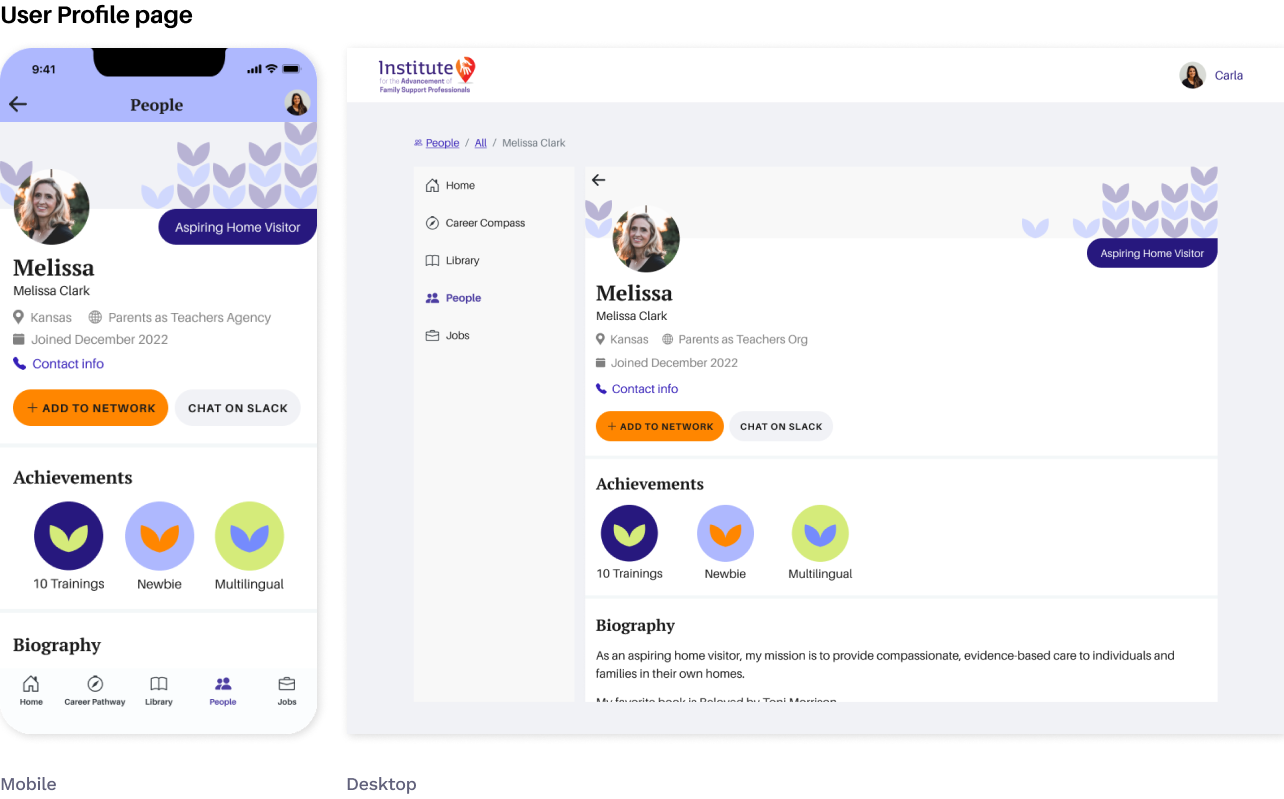
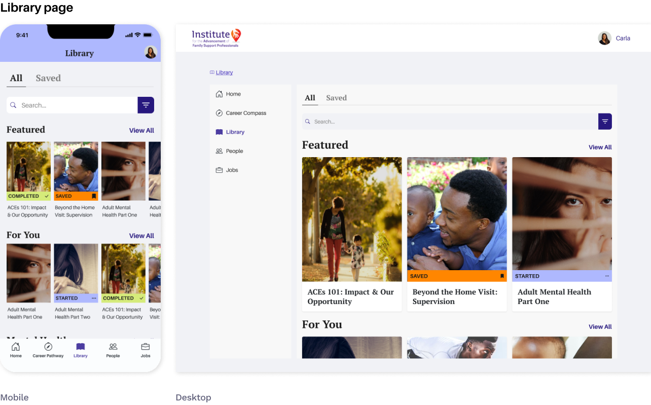
Responsive Design
We designed the app mobile-first. Then we mocked up key pages for both mobile and desktop, showing how it works (and feels great) on any screen.
Prototype
To bring the app to life for our client, we crafted interactive prototypes showcasing key features. Take a look at the Career Readiness Assessment flow:
Lessons learned while documenting a design system
- A single typography sheet with dynamic sizes ensured consistency even though we had separate typography sizes for two screen types.
- Keeping styles and components in the same Figma design file streamlined design iterations.
- Written notes for developers enhanced the clarity of component interaction documentation.

︎︎︎ We highlighted 1 typography sheet for developers while keeping the other for designers.
If I had more time, I would...
-
Prioritize user testing for the Career Readiness assessment feature.
- Ensure that the navigation structure is intuitive and logical for users using metrics like task completion, error count, and time on task.
- Address keyboard navigation, alt text for images, and other accessibility requirements.
- Conduct further Design Quality Assurance (QA) to ensure design standards are met consistently.