KSTASN
A resource hub for special education redesigned︎ CLIENT PROJECT
MY ROLE
Information Architecture, Design System, Prototyping
TEAM
2 UX designers, 1 Project Manager
Information Architecture, Design System, Prototyping
TEAM
2 UX designers, 1 Project Manager
Launched in 2014, the KSTASN website is packed with valuable resources for special educators, but its design lagged behind. This redesign delivers a fresh look and intuitive navigation through a streamlined design system, empowering educators with a modern platform for learning.
View live site︎︎︎
View live site︎︎︎
THE CHALLENGE
Feature-rich, visually dated: KSTASN website needs a modern makeover
Challenges that the old website had:![]()
- Dense menu was tricky to navigate through all the amazing resources.
- Didn't capture the values that KSTASN embodies.
- Lack of a design system was causing incoherent components and styles.
THE GOALS
A new design system and intuitive navigation
Our goal was to create a new design that offers these key elements:
- An easy-to-use navigation: clear menus and intuitive search.
- A reflection of KSTASN's spirit: friendly, professional, and always there to support.
- A unified and responsive design system: a single source of truth for components, patterns, and styles – no more disjointed experiences.
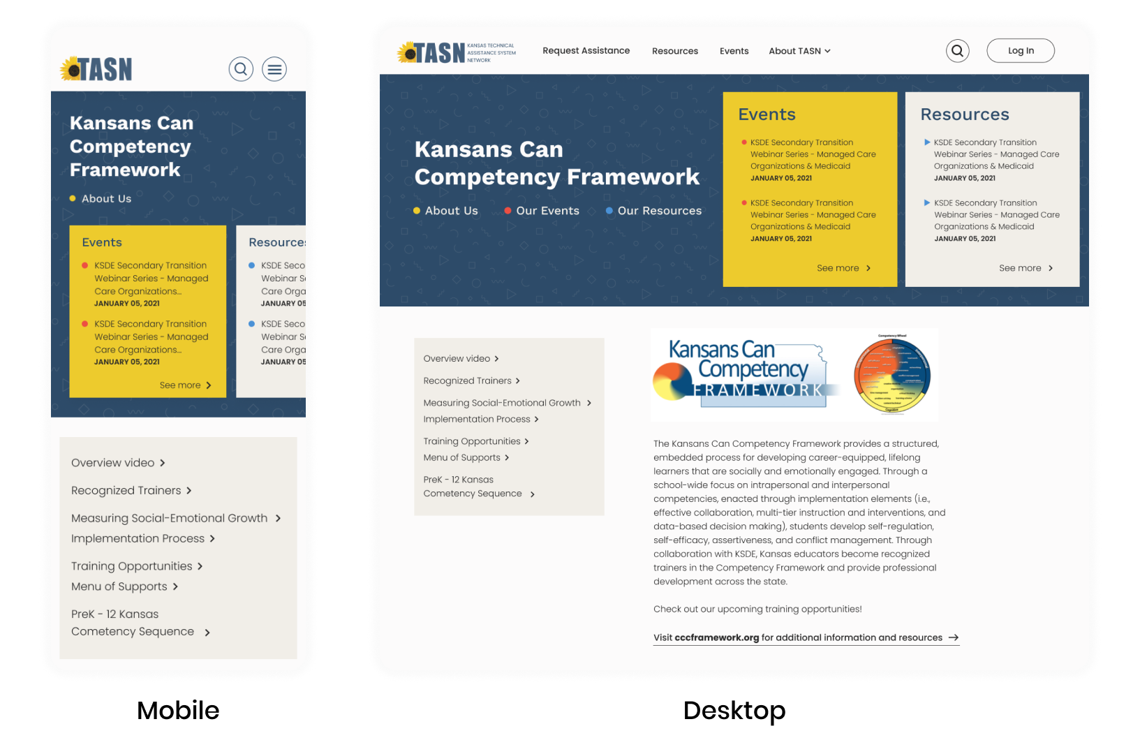
New sitemap simplifies navigation
Prioritizing clear navigation, we kicked off the website refresh by restructuring the sitemap. We streamlined the top-level menu to just four main pages, chosen based on website performance metrics.

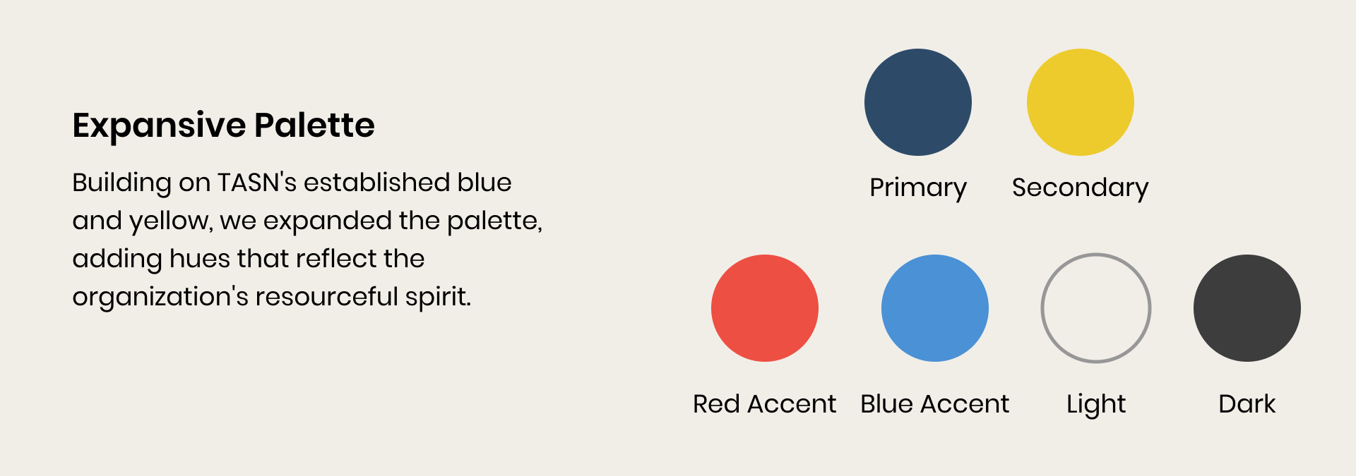
THE BRANDING
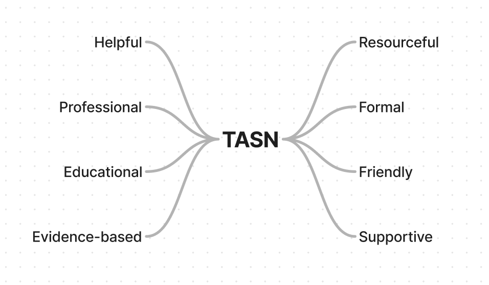
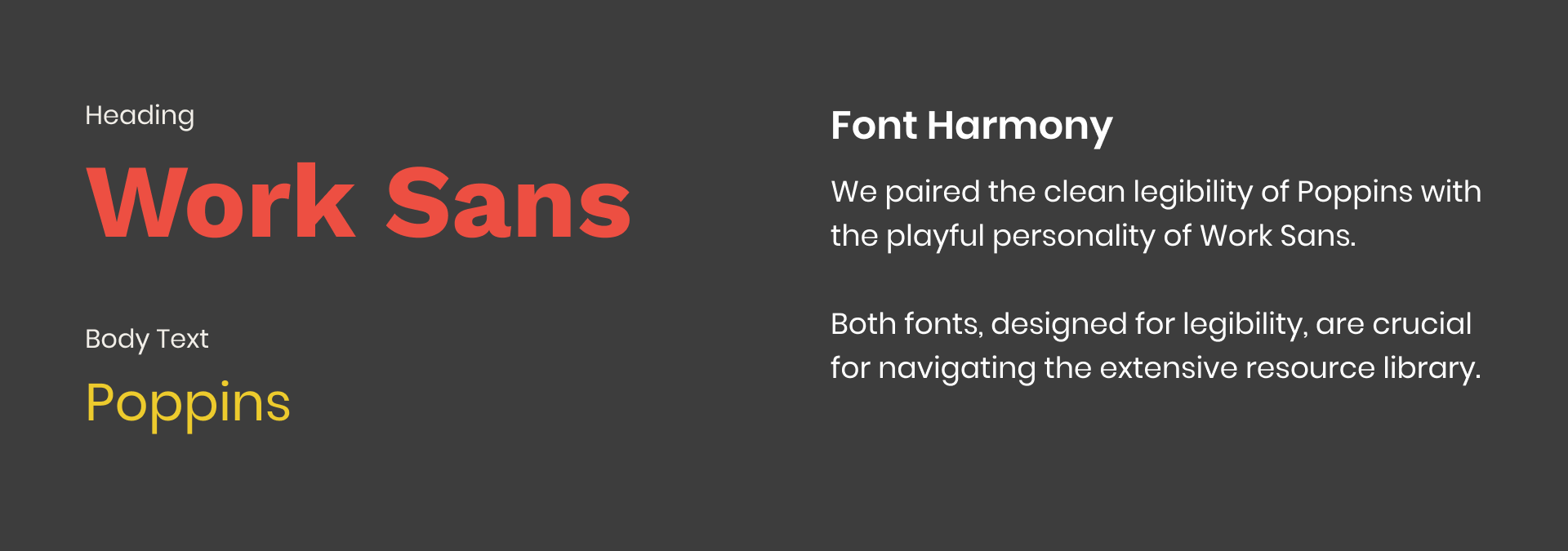
Crafting a visual language that's Professional, Resourceful and Friendly
To guide our design process, we started by identifying key terms that describe the visual language: "professional," "resourceful," and "friendly."
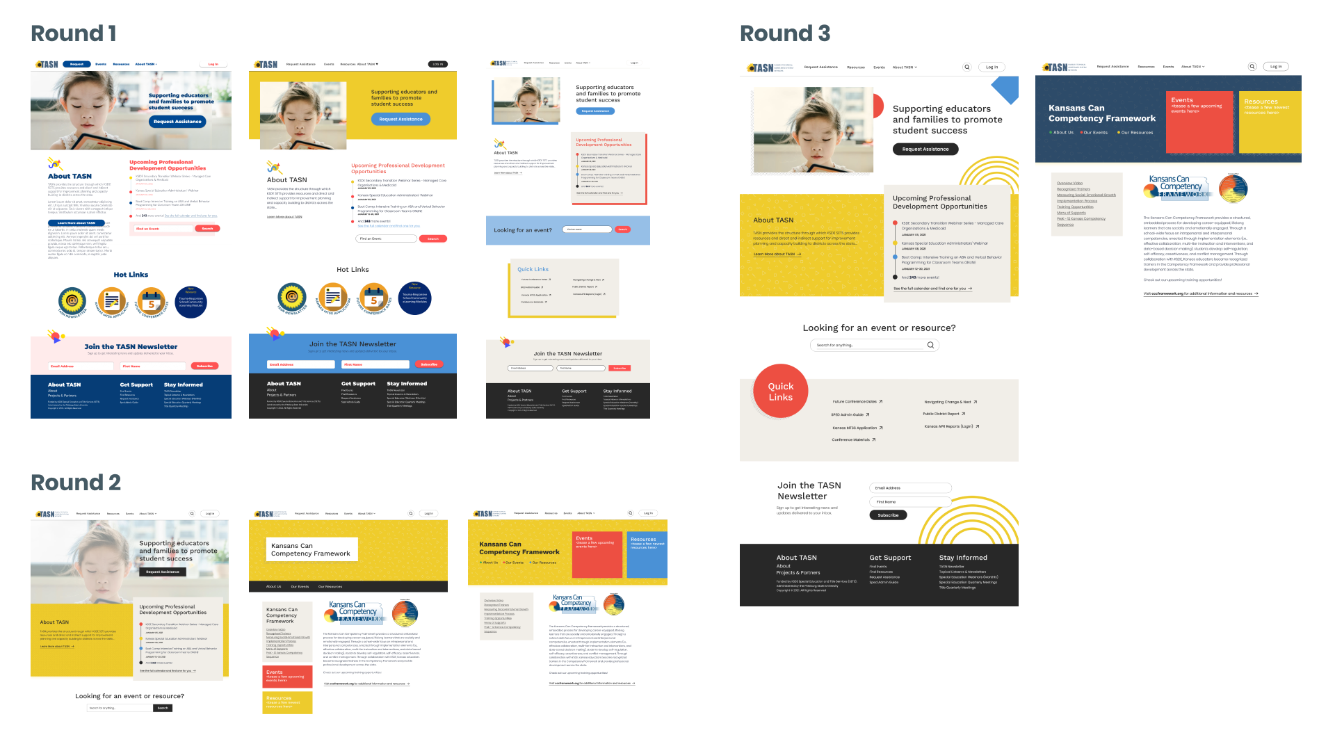
Exploring ideas and refining our vision
We iterated through three rounds of design explorations. Here are the feedback we got each round:
- Round 1: Strong structure, but elements clashed.
- Round 2: Cohesive elements, but lacked warmth and approachability.
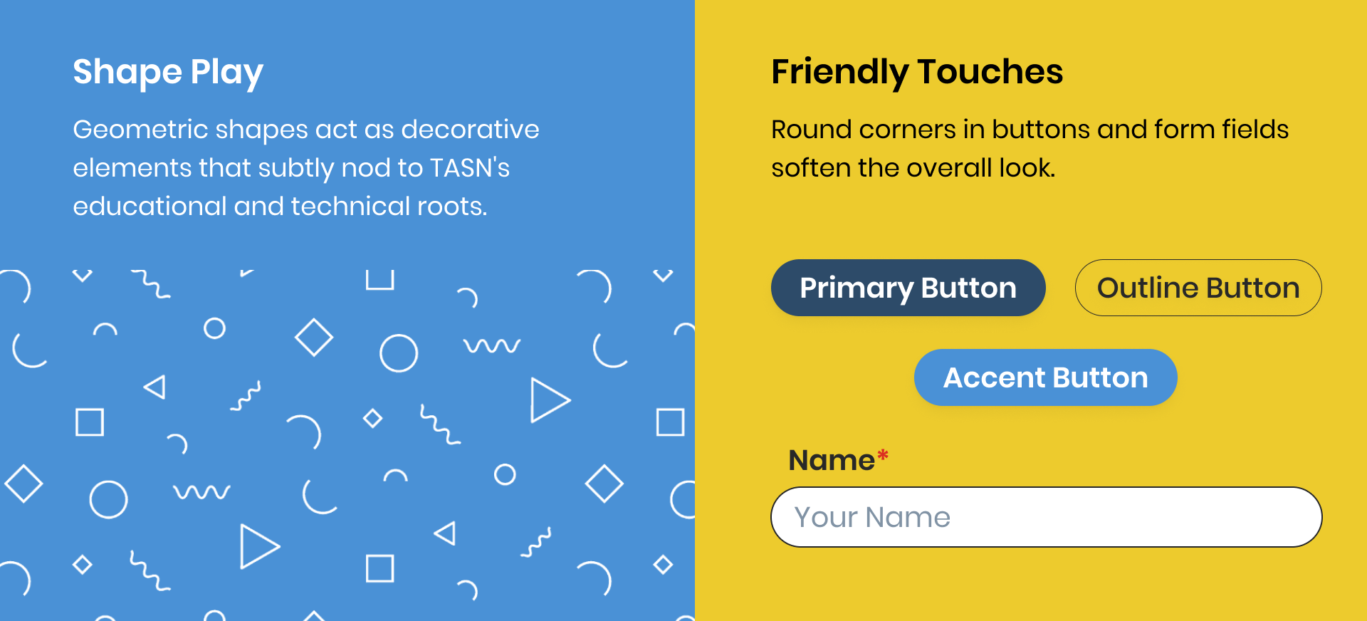
- Round 3: Textures & shapes added friendly touches and vibrancy, prompting further refinement.
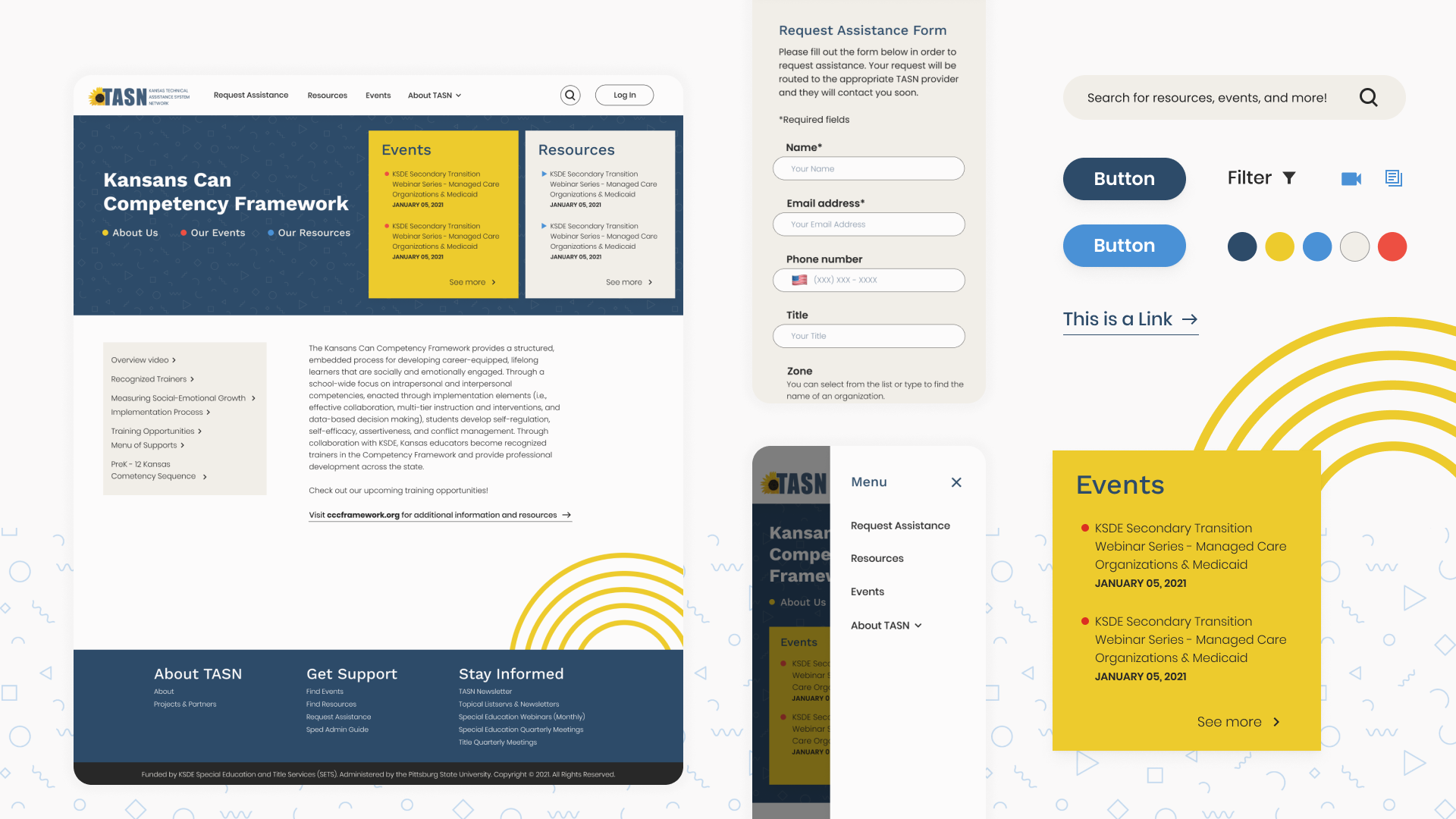
Implementing a design system
Building upon Bootstrap, the existing framework, we established a comprehensive documentation of TASN design system in Figma. This system encompasses all essential styles, components, and patterns.
View the design system in Figma︎︎︎
View the design system in Figma︎︎︎
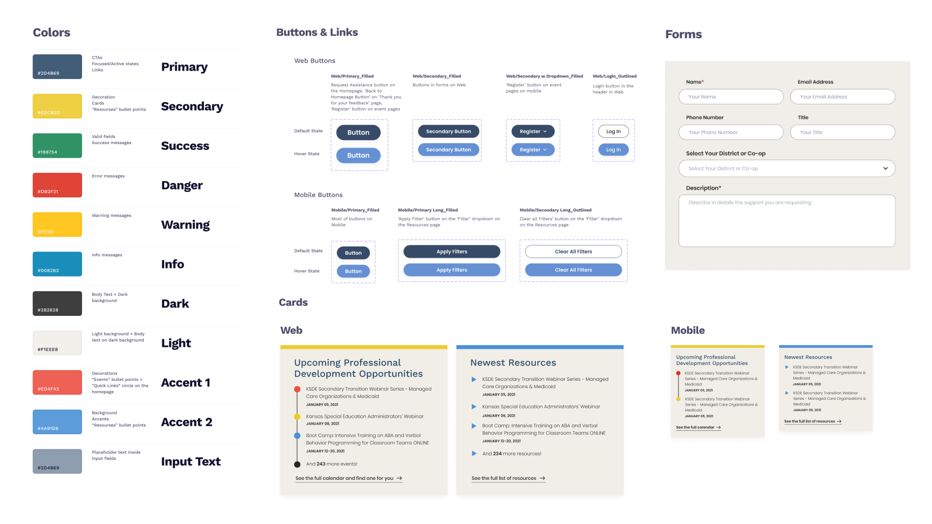
Detailed notes of components (interactions & states) ensured clear communication with the development team.
Three major iterations
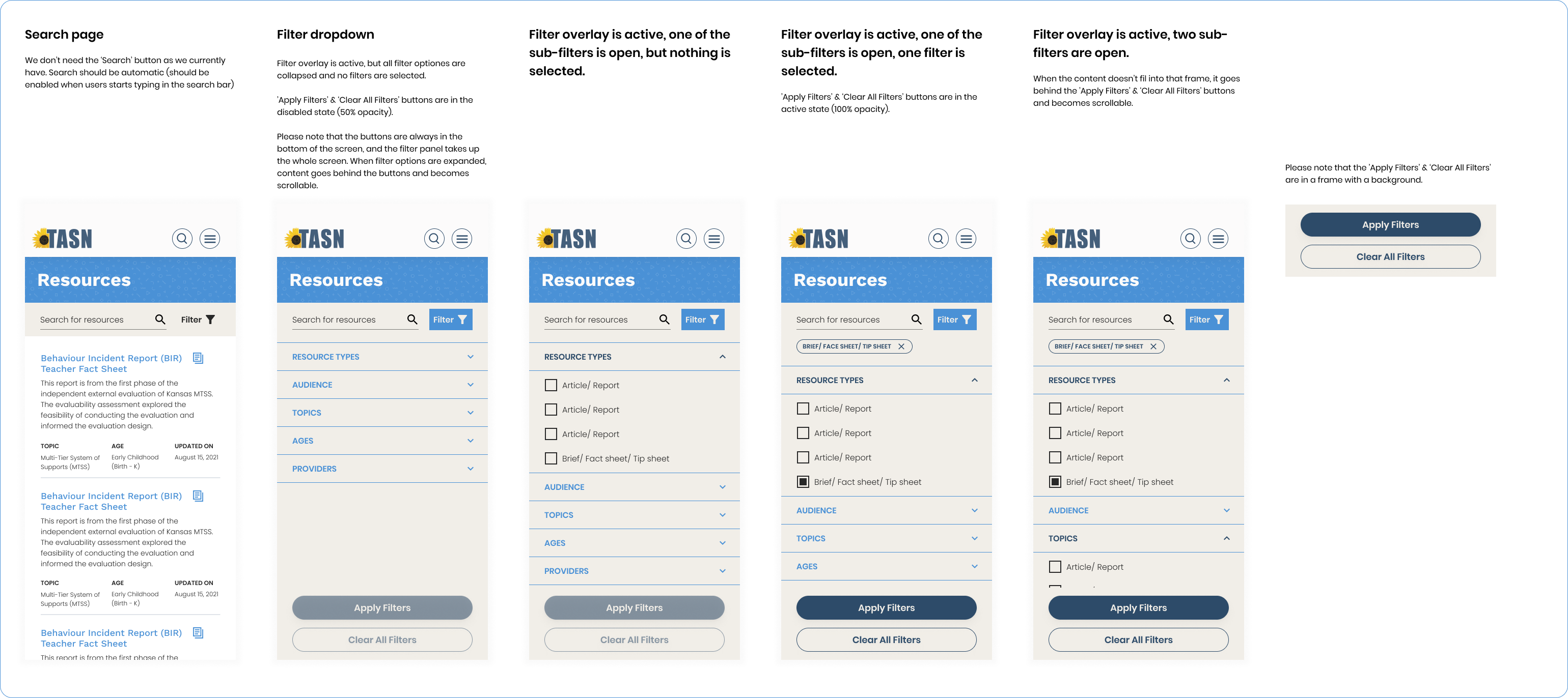
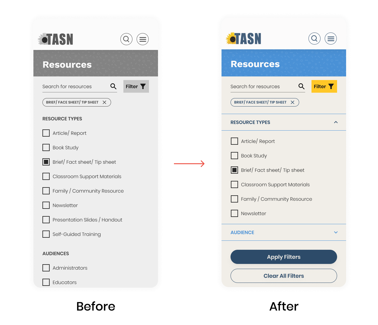
01. Implemented responsive filtering
- Mobile users struggled with scrolling through the expanded filter.
- Implemented collapsible filter categories.
- Allowed users to select filter options without extensive scrolling.
02. Highlighted events and resources on project pages
- Each TASN project page is linked to valuable events and resources but they were hidden.
- We now highlighted them at the top of each project page, shining a spotlight on their importance.

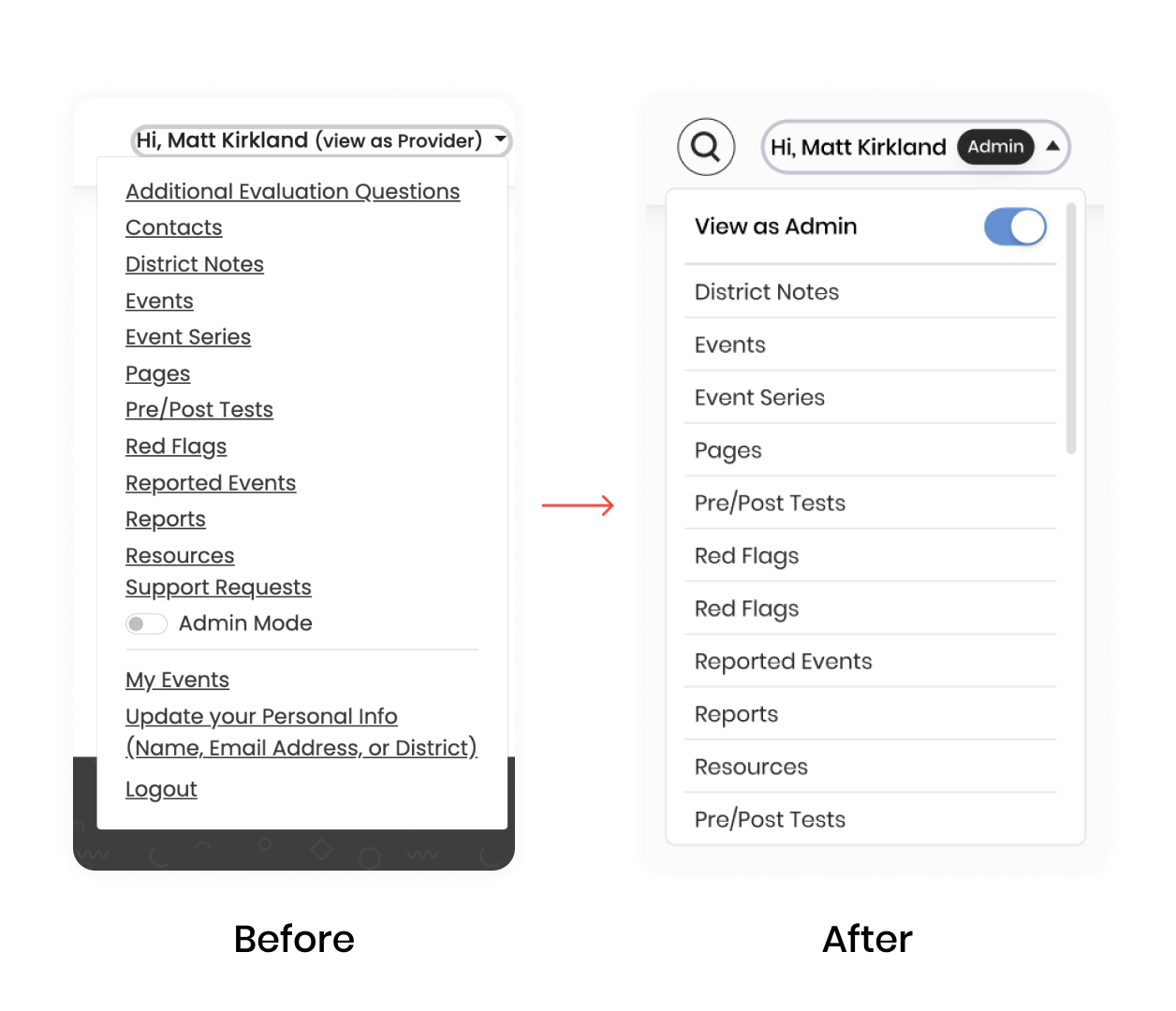
03. Refined dropdown menu for enhanced clarity
- Eliminated visual clutter and confusion by separating menu links, based on user feedback.
- Clarified the "Admin mode" toggle switch with a clear label, improving usability.
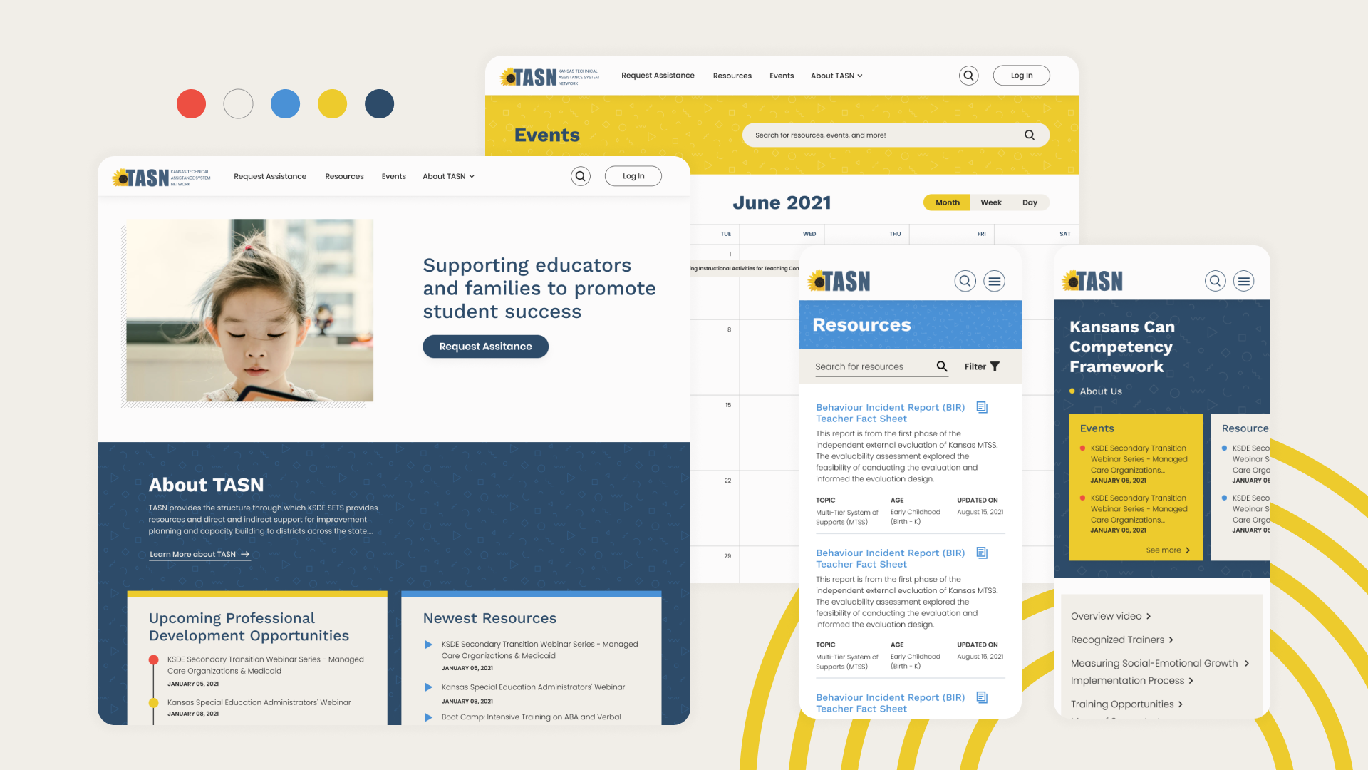
The final design that blends multiple elements
By blending multiple elements, we crafted a design language that embodies TASN's core values: professional, resourceful, and, above all, welcoming. This balance ensures users feel empowered and supported as they navigate the vast amount of resources. Here's what makes our new design tick:
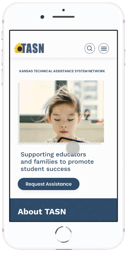
Responsive design
A huge segment of TASN’s users are on their mobile devices - so we paid special attention to making sure the site works great on all screen sizes.

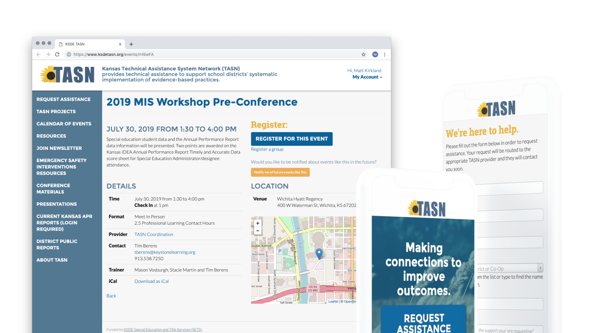
Prototypes
Homepage and Request Assistance Form
Resources page and Filtering
Reflections & Next Steps
While we're thrilled with the initial impact of our website updates, there's always room for growth. Looking back, here are some key takeaways:
- While time and budget limitations steered us towards smaller updates, deeper research upfront could have informed even more impactful changes.
- Closer collaboration with developers in the early stage, especially on intricate elements like the filtering system, would have avoided redundancies and ensured smoother integration with existing software.
- The next step would be to track our site metrics such as completion rates, time spent, and user satisfaction.