Hot-desking
Desk booking system for a hybrid workplace
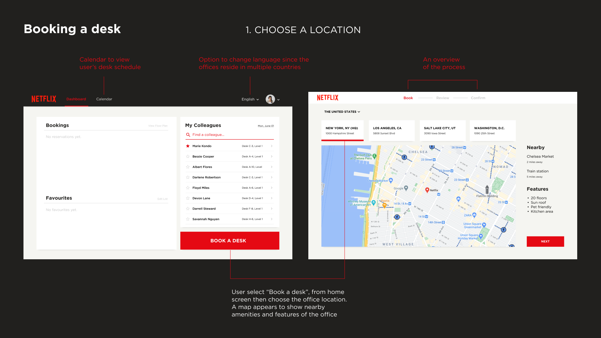
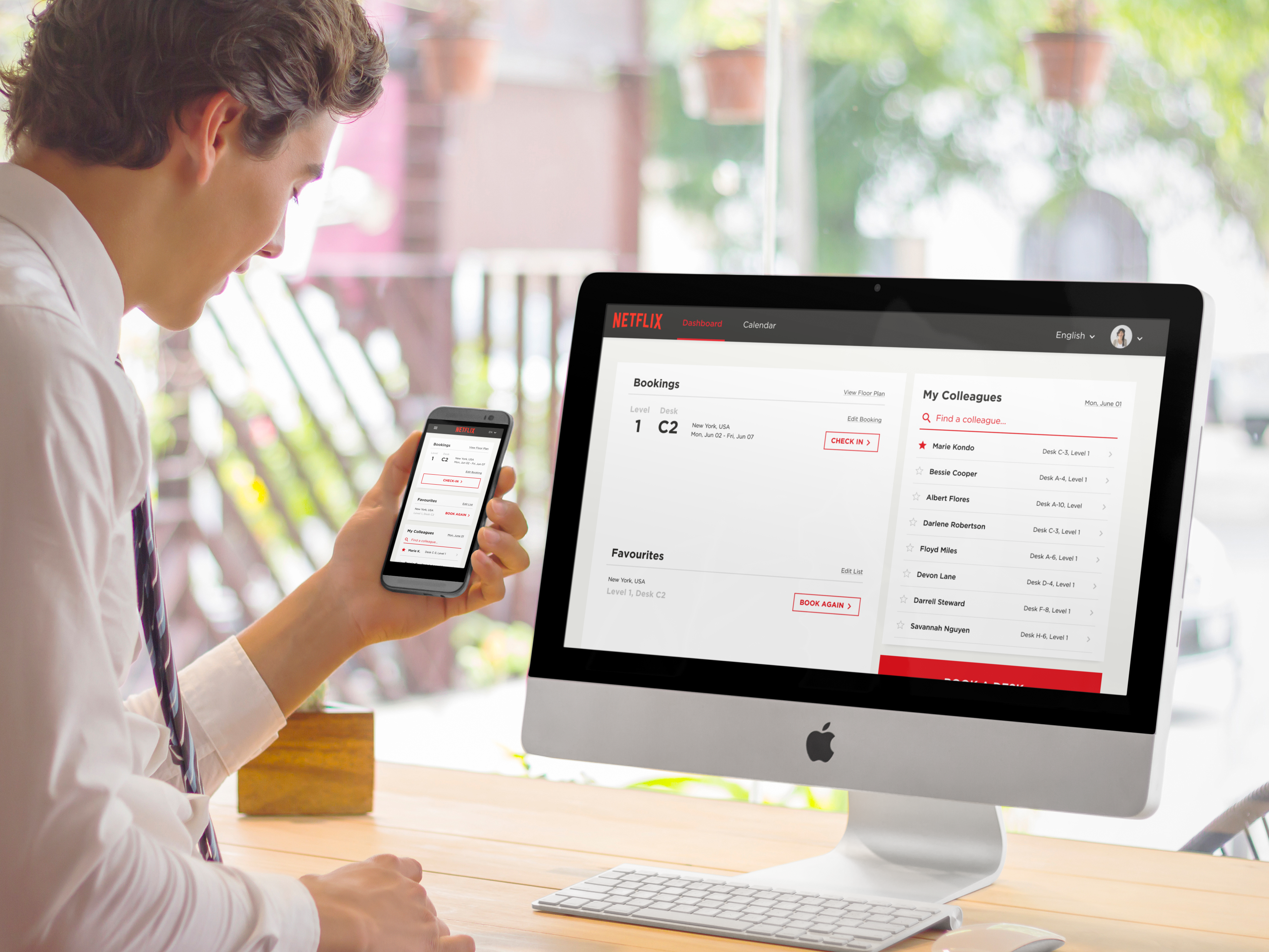
This project aims to develop a tool for on-demand desk assignments at a global company. The solution is a responsive booking system that accomodates desk reservations, travel, and in-person searches for staff who telecommute and work from home. The design needs to complement an existing brand identity so I choose to go with Netflix’s simple but powerful branding.
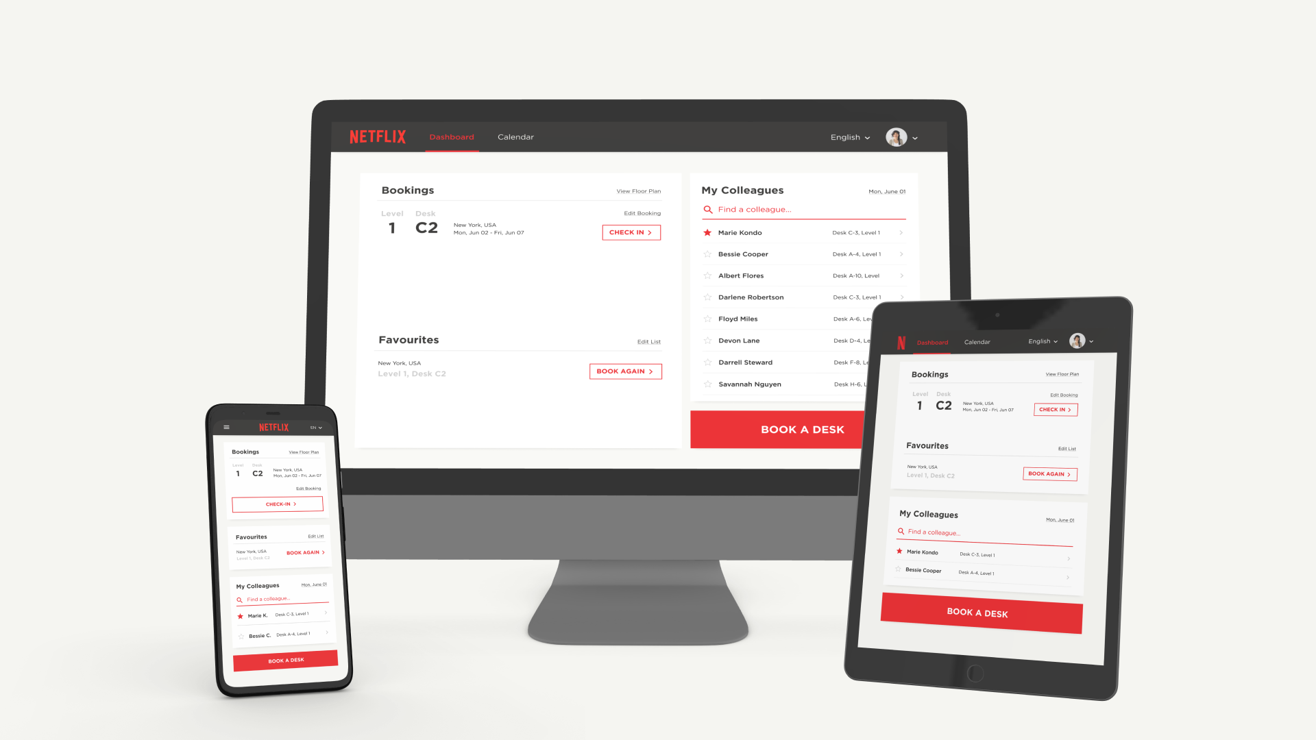
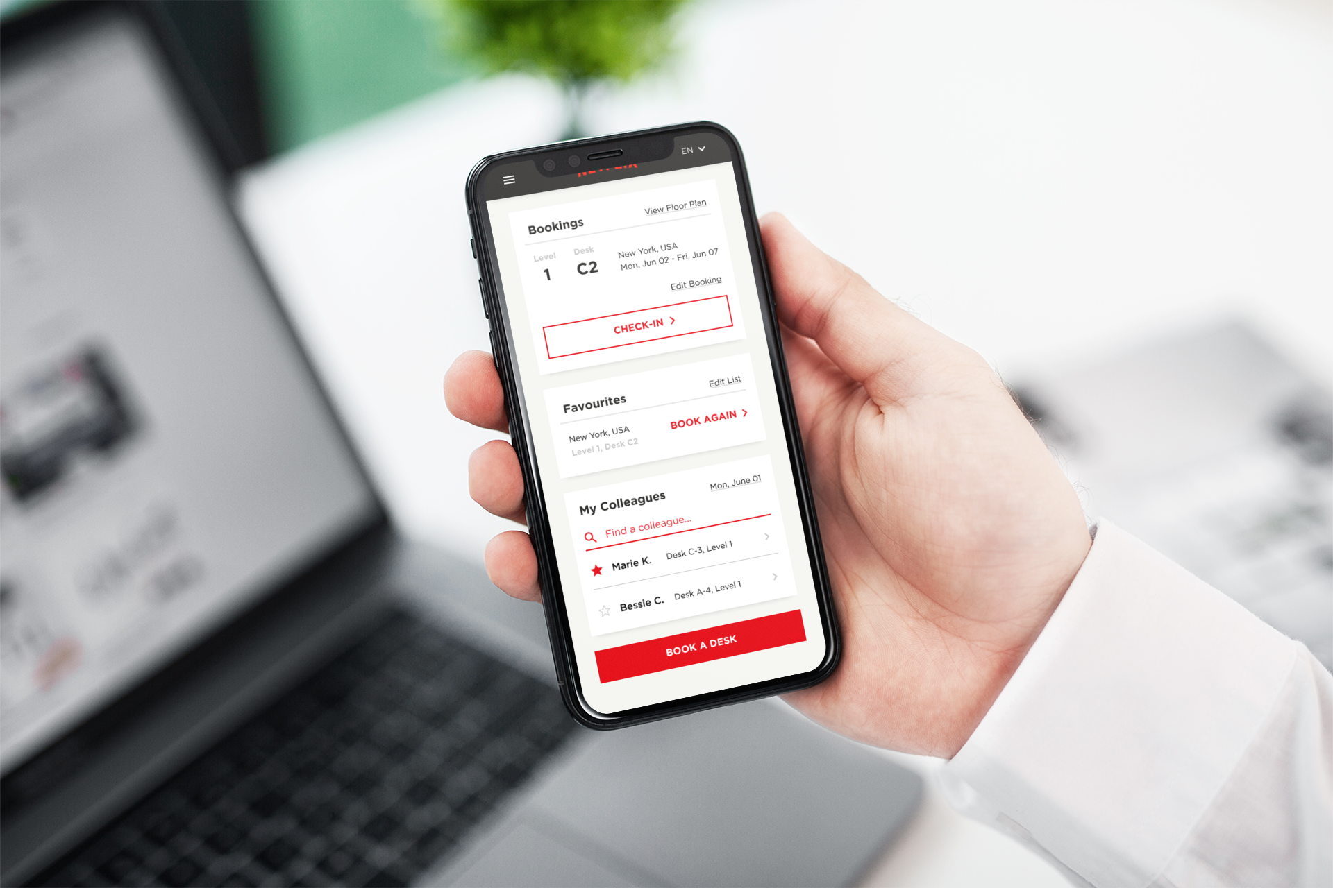
 A responsive booking system working across all devices
A new office model
The company is moving to a hybrid office model: employees will not have assigned desks, but instead can reserve a desk at any location the company has. There are multiple office locations, spread across different countries and the offices have many floors. A new system needs to be put in place for staff to book their desk locations for one or more days and locate where their colleagues will be working for collaboration.
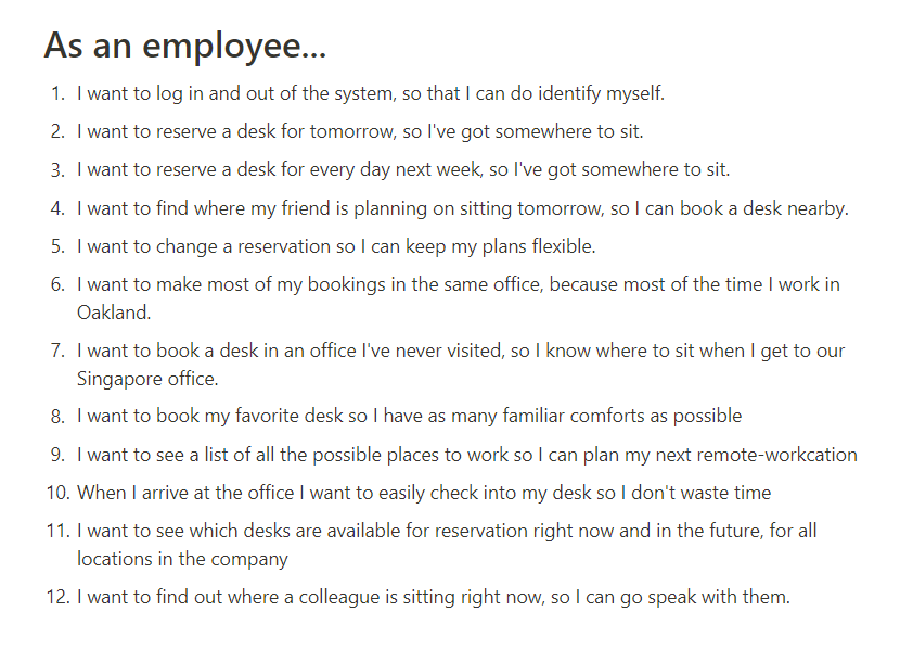
User stories
I developed a set of one-sentence desciptions of actions that user can perform in the system in order to articulate what the users want and why they do it.
Testing paper prototype
Using the set of user stories, I made a low-fidelity paper prototype to visualize the process of booking a desk through the system. I then tested this prototype with users and gathered their feedback. Here are the things I learned:
- Rephrase buttons to make them more clear (Ex: Find a person → Find a colleague)
- Option to contact the person for switching desks
- Option to see what amenities are there in the building and at the desk
- Option to find a friend while booking the desk
- 2D/3D views are not necessary
- Provide hiearchy to indicate the steps users need to take
 Images from the user testings
 A visualization of
users' tapping positions and suggestions (in red)
A visualization of
users' tapping positions and suggestions (in red)
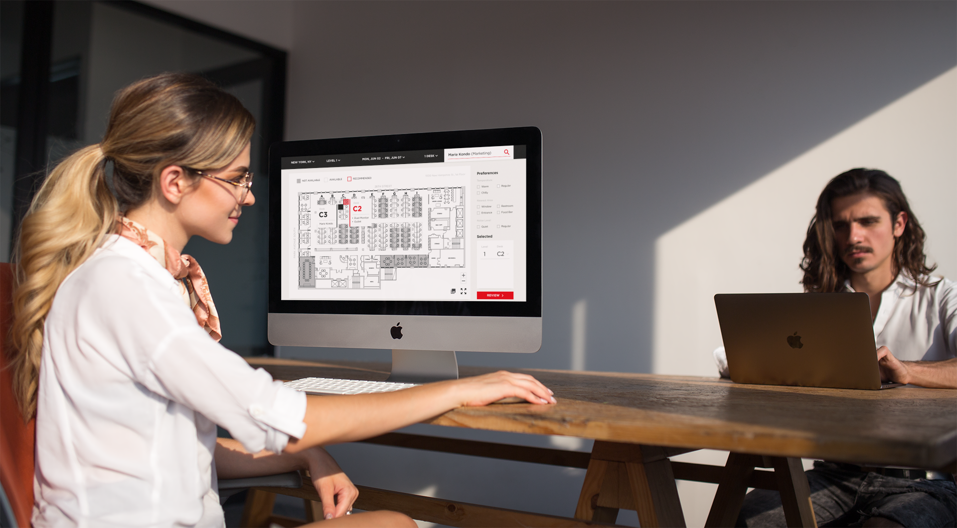
Moving to digital
After adjusting the design and making a low-fidelity prototype in Figma, I tested with seven other users using the Maze remote testing site. I asked the testers to complete two main tasks:
- Book a desk on the 3rd floor
- Book a desk near your colleague (Marie Kondo)
Things I learned from this test:
- Most users did the second task better than the first task
-
Having the drop-down menu in the full map layout be more visible as buttons
-
Have some distinctions between the "BOOK A SPOT" button and "FIND A COLLEAGUE"
- Adding more "Available" seats so it's more apparent which seats are available.
 Low-fidelity prototype on Figma
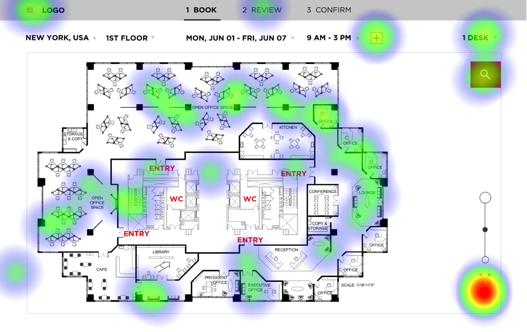 95% of the misclicks were in the first task, booking a desk on the 3rd floor. Users didn't know that they can click on the drop-down menu "1ST FLOOR" to change the floor plan. Most users tried zooming in and clicking on the "Search" button to look for answer.
 I solved this problem by highlighting the drop-down menu and making it more apparent what steps users need to make before selecting their seats.
 The adjusted screen after feedback.
The final design